Uniform blog/Authorable components as the key to unlock design system operationalization
Authorable components as the key to unlock design system operationalization
Authorable components as the key to unlock design system operationalization
Many digitally ambitious brands invested heavily in design systems early on, but not everybody who made the investment capitalized on it yet. Over the last couple of years, we've heard a similar sentiment from the brands and implementers—the dream of a sustainable design system that is activated and leveraged properly to ship consistent digital experiences fast is still that—a dream.
The reality can be rather shocking. The bigger the enterprise, the more common it is to see multiple design systems built and maintained either due to the silo effect, acquisitions, or other historical reasons. Then, there are 50 versions of a Hero component, and two more are being built as we speak by a new agency that took over the project. Messy content model and lack of separation of content (what to show) and presentation model (how to show it), and then, my favorite - abandoned storybooks that were so meticulously maintained in the engineering phase of the design system and now left for the "cleanup sprint," since there is "no time for that," the team needs to deliver two more snowflake components this sprint.
Authorable Components to the rescue!
While there is a lot to unpack about what's wrong in this picture, and I will share more thoughts on this topic, there is one particular angle that I'd like to focus on in this post. New component development is still very much an engineering job, and while there are use cases for it, in many cases, it doesn't have to be.
This is where the concept of Authorable Components comes into the picture.
In the context of a digital experience, a component is a unit from which a channel-specific experience is built from. Whether it's a web page on the web, a mobile screen, or an email, it is more often than not built from components as reusable building blocks.
Building a component has two main concerns - code and model (both content and presentation aspects). Sometimes, front-end engineers would do both jobs - coding up the component and creating a model. Sometimes, they would collaborate with an information/content architect responsible for the modeling part. This is almost always a better scenario, as the component's model is a critical part of getting it right, as it will "interface" with content authors, web producers, marketers, and merchandisers who assemble experiences with those components.
For the sake of simplicity, we excluded designers from this mix, even though they have an important role to play (more on that in another post).
The notion of Authorable Components extends the zone of responsibility of an information/content architect, providing no-code tooling to build new components (molecules and organisms) from existing smaller building blocks (atoms).
I am using the terminology from the brilliant Atomic Design Methodology will guide us through this, specifically atoms, molecules, organisms, templates, and pages.
When properly implemented, Authorable Components can give digital teams wings. The most powerful aspect is the autonomy in building new components from engineering, which significantly reduces the cost of building a new experience. Since no new code is involved, launching new experiences is cheaper, faster, and virtually instant. As no new deployment is needed, you can simply create and publish a new component and see it on the page live.
It's important to mention that Authorable Components don't have to compromise on governance, as newly authored components can and should be subject to review and approval before being published.
More configuration, less engineering
This approach doesn't have to completely eliminate engineering; that's not the purpose. It helps shift engineering focus to bespoke experiences or more exciting and flexible building blocks and frees up time from the assembly. Configuration-based assembly can be taken care of without the special knowledge of which fancy front-end library is running the rendering, paving the way for specialization in experience engineering (is this a thing yet?). Some folks geek out about the most flexible content model, and others lose themselves in the art of design engineering and optimizing front-end performance. Everybody wins.
How does it work?
The mechanics of the Authorable Components approach is fascinating.
While your mileage may vary, this is what we see as the common theme.
- IA architects work with a set of primitives (atoms) that correspond to the design system specification. The primitives can be not only text, buttons, and images but also layouts and containers, and more non-functional kinds - like animation containers pre-wired to give the option to configure the behavior from a set of allowed options.
- At this stage, the authored components are typically connected to a given content source — a CMS, PIM, commerce catalog API, or anything else. With Uniform, we also take a no-code approach to this stage.
- Authorable Components are registered in a shared library after review and validation.
- At this point, the components are ready to be consumed by web producers/content authors and marketers who build customer-facing web experiences from those. In the case of a multi-brand setup, these components can adapt to the theme of the target brand site, therefore achieving reusability and cost savings when scaling your design systems.
Authorable Components and creative freedom
Does this approach limit creative freedom? Depending on how you define it, I guess. The spectrum of preferences and choices is very wide. Some teams need absolute flexibility in their new component creation process - down to the font size and font family. At the same time, this is a horror story for other teams that limit the configuration options to changing text and image fields and button labels. Authorable Components works best for the teams that fall somewhere in between - they want flexibility with some control, where new components can be authored with configuration options around presentation/layout that are pre-set and locked by the design system.
That being said, the beauty of Authorable Components is that you define the modality per use case by modeling the options you need on atomic components. Don't want the users to build grid-based containers - don't enable it :)
Impact of Authorable Components
We've experienced the magnitude of the impact of Authorable Components with our marketing team working on uniform.dev. This approach provided a way to launch new experiences without touching code at all, where adjustments can take seconds and net new experiences are launched in minutes. Most of our pages are built this way now.
How it works with Uniform
Uniform's implementation of the concept of Authorable Components relies on the Patterns functionality. When we introduced Patterns back in 2021, we wanted to solve two key problems of experience management - 1) provide with the ability to share a global component across pages and 2) unify multiple components along with child components into a reusable entity.
Since then, Patterns got a lot more incremental superpowers - you are able to build them visually in a live editing environment and connect individual parameters of an underlying component to any content source - without writing any glue code yourself!
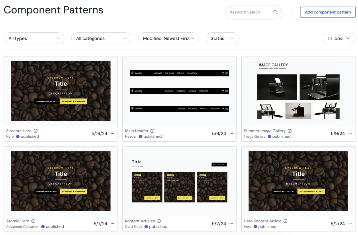
Most recently, Patterns got an additional upgrade - the ability to override children on the instance level, which enables you to build container patterns of higher complexity and hide locked parameters. In addition, we improved discoverability with a dedicated Component Patterns library view:

Learn more about Component Patterns in our documentation.
If you don't have the time to read the docs, check out this quick demo on how you can create a new component with Uniform in a couple of minutes:
Like icing on a cake, the ability to copy-paste components and patterns is an additional quality-of-life improvement that allows us to create new experiences even faster:


.png&w=1080&q=90)

