Uniform blog/How Uniform built a personalized and A/B tested digital holiday card
How Uniform built a personalized and A/B tested digital holiday card
How Uniform built a personalized and A/B tested digital holiday card
At Uniform, we love to drink our own champagne.

In other words, our own website that is built with Next.js leveraging the Jamstack architecture is powered by all the latest capabilities of the the Uniform Visual Workspace. We are also using our “canary” instance for our own website, allowing us to flex the upcoming features before they are merged into the
stable branch.Sometimes can have bit of fun with all this, and the holiday season is the perfect time to go a bit more nuts.
So one day one of our Unifolk, Will Robinson, had an idea:

And naturally, like all digital projects, we suffered quite a bit of scope creep 😂
“...Why don’t we build a digital version of the card as well? And personalize it, and localize it... and A/B test it!...”
YES!

We decided that the card will be personalized for our four audiences: 1. our own Unifolk; 2. our customers; 3. our partners; 4. our investors.
Since we are a global company, it also needed to be localized in three languages - English, Danish, and Ukrainian - and we wanted to A/B test different “happy holidays” messages. Since QR codes are 🔥 again, we naturally added those into the mix.
At this moment, our Uniform platform consists of these three main pillars, and we wanted to use all of them for this project!
1. Uniform Optimize
Our decoupled edge-side capable personalization and A/B testing engine. Since we want to personalize the holiday card for different audiences and A/B test “happy holiday” messages, this is perfect for that.
2. Uniform Canvas
Our composition and presentation management layer allowing the creation of experiences without code. Since the virtual holiday card is an experience, it’s perfect for that as well!
3. Uniform Mesh
Our integration layer / framework. This capability allows Uniform to pull content from multiple headless CMS and/or commerce sources. Since we already store our content in Contentful, we have the content for the virtual holiday card sorted as well.
So having all three ingredients, we queued up the music and set off to work.

Part 0: Design
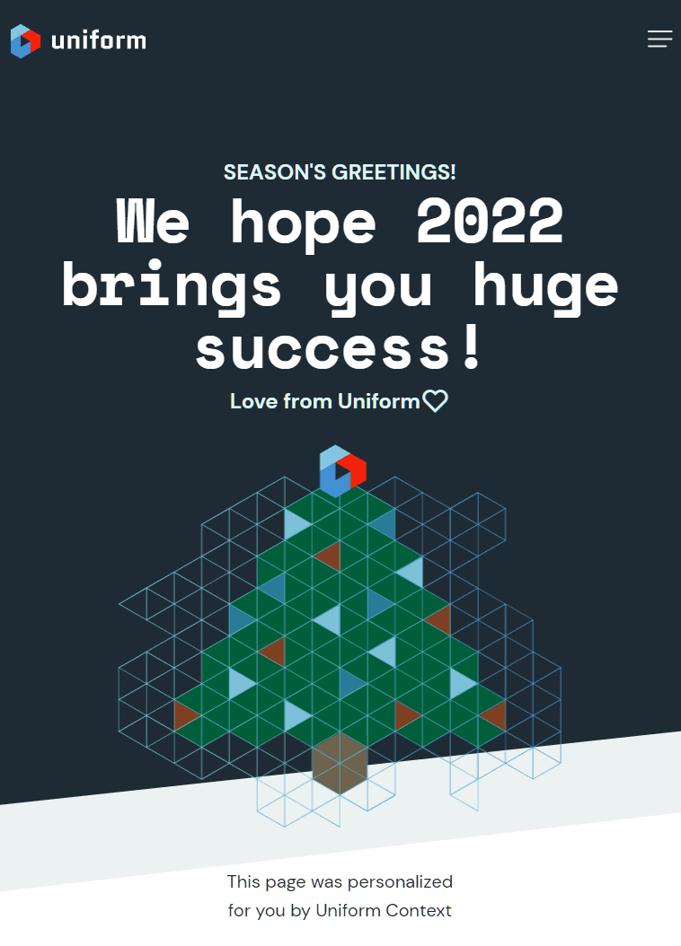
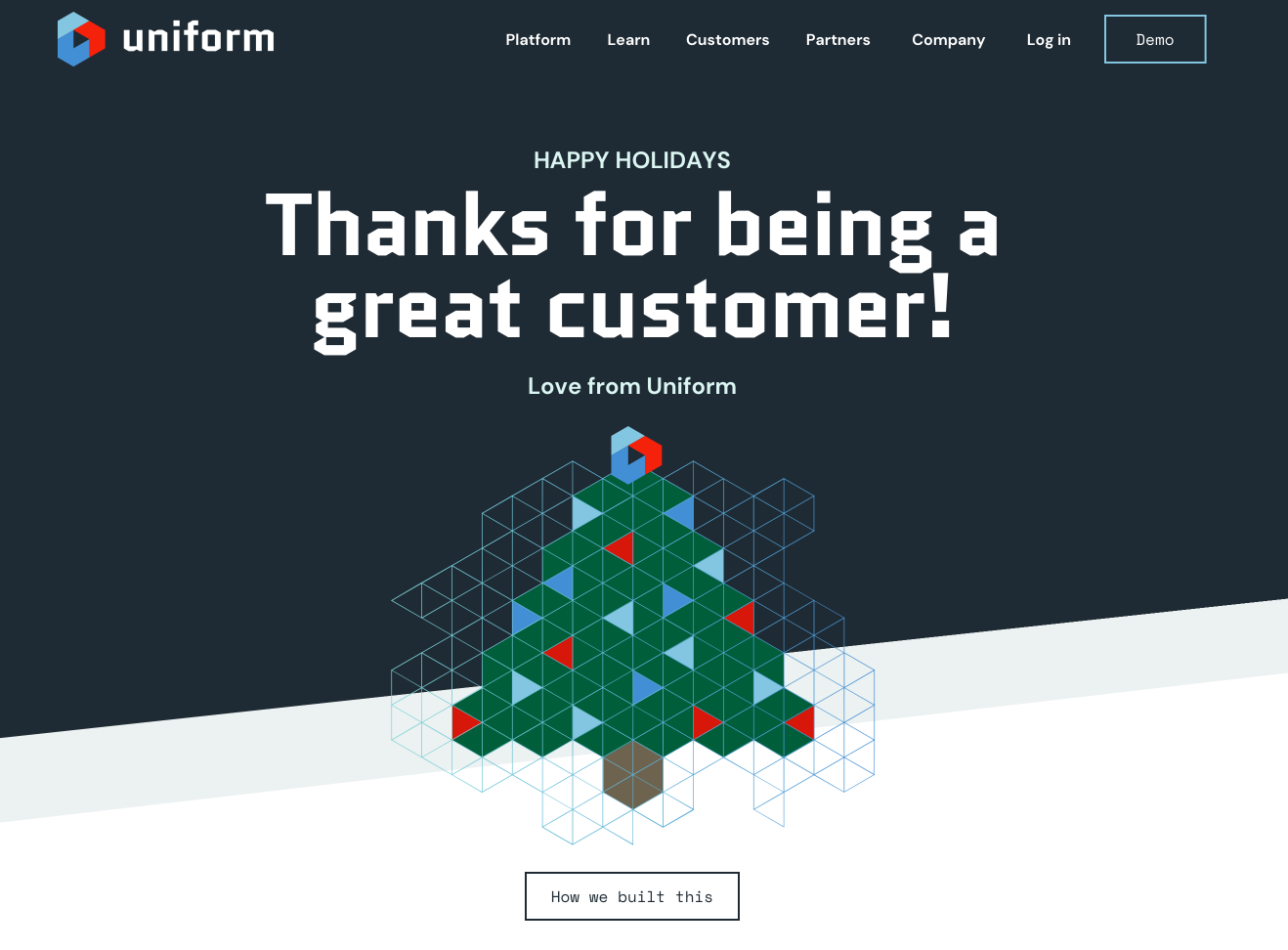
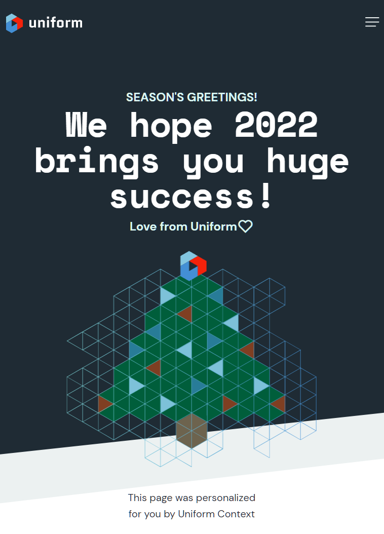
We started with the design. Our friends at Studio Rover helped us out and built us this gorgeous triangular Christmas tree as a part of the process:

The design represents a single component and is consistent with other headers we already have on our site:

So all we needed to do is to add one more page and build one more component 🙂
Part 1: Composition
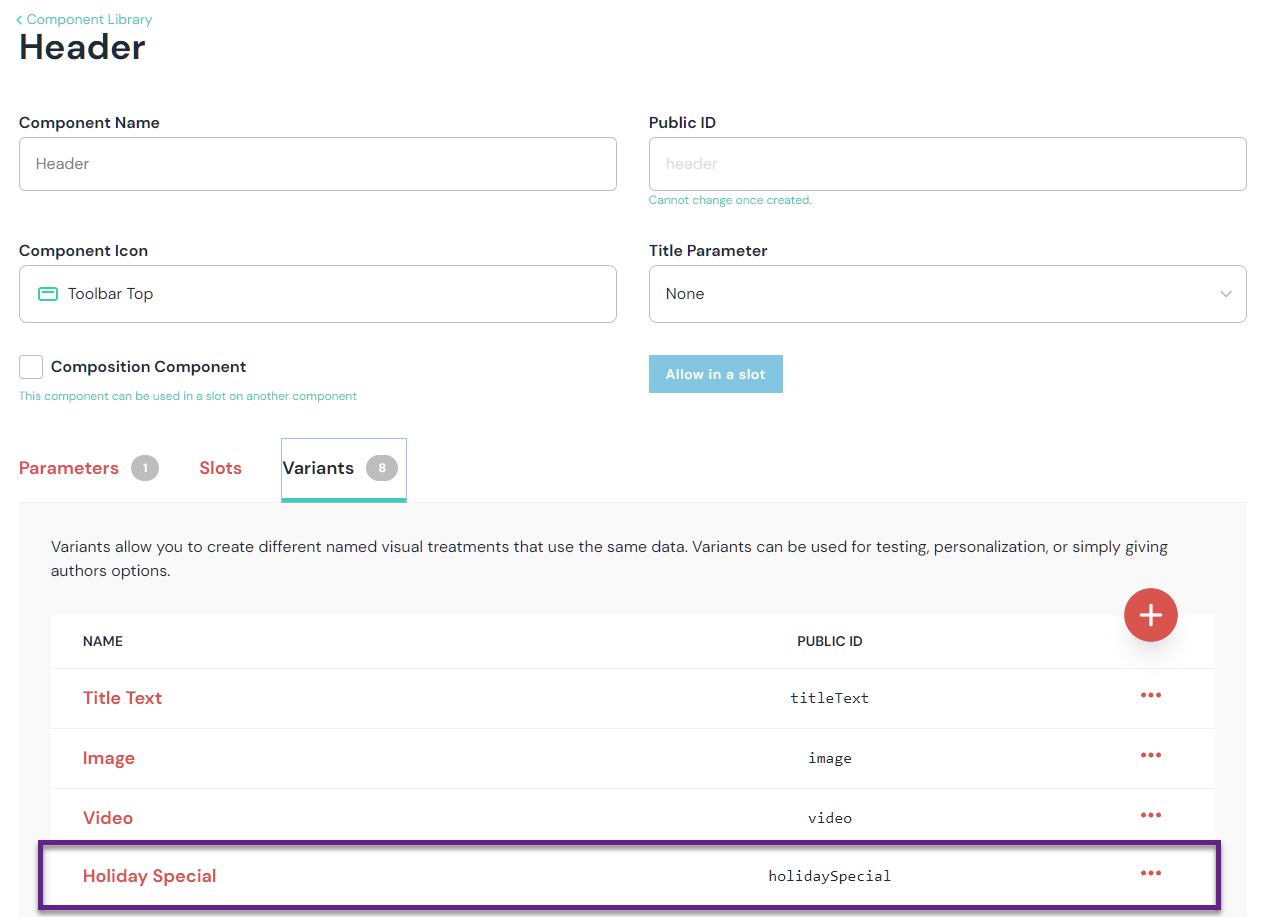
Now since we already had a Header component used all over the site, we ended up registering a new variant called “Holiday Special”:

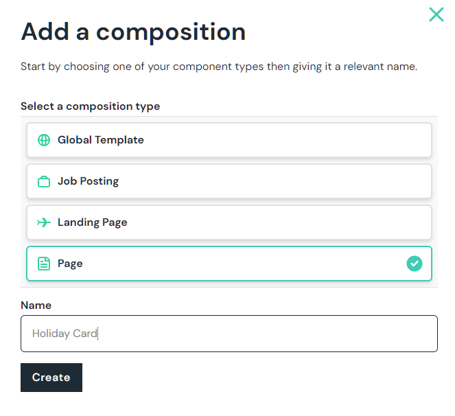
Afterwards, we created a new composition called “Holiday Card” from one of the existing Page composition types.
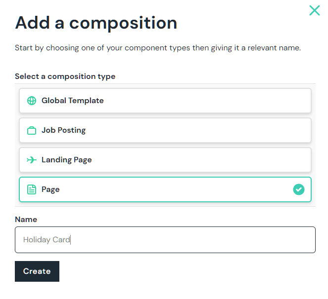
💡Sidebar: each page on our site has a unique composition, this is how we decided to model our pages. We have four different composition types: one for landing page (where the setup is quite different), one for all the Job Postings (it acts as a template), and one Global Template, where we can define globally shared components across all pages.
We gave the composition a slug “/cheers” and added the Header component into the slot.
This newly placed Header component is configured to use the “Holiday Special” variant and since we already have this component bound to the Contentful integration, binding new Contentful entry with the newly placed component was a breeze:

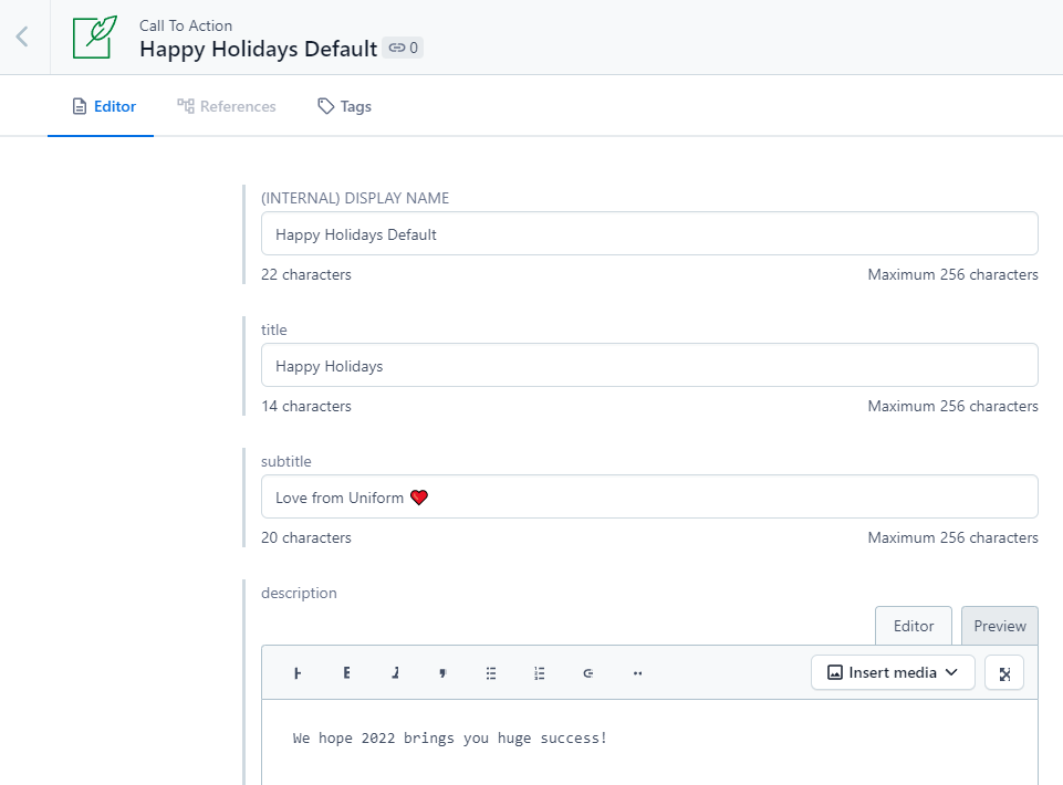
The content model “Call to Action” was already there in Contentful, so we created a new entry of that type and filled out the content:
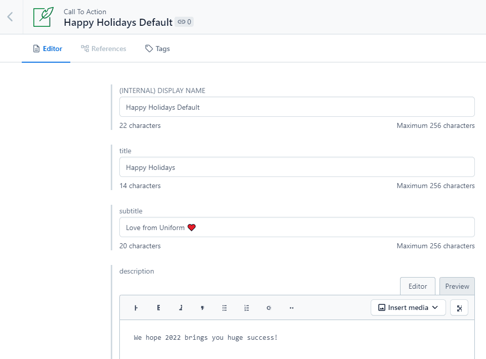
The rest was up to the front-end developers to implement 🙂
Part 2: Front-end
Now we needed to implement the presentation of our “Holiday Special” display variant of the Hero component. Caution: we’re entering a state of developer bliss.
Since Uniform Canvas does not dictate the way this component variant needs to be built, this allows front-end devs to have all the freedom of expression they need. The process of implementing the new display variant consists of two parts:
1. Implementing the new React component with the desired behavior.
Since we use Next.js, we have to use React. Canvas also has an SDK for Vue.js.
2. Registering this new variant with the Composition, so it can be found in the codebase.
The new component was dropped next to other Headers we have:
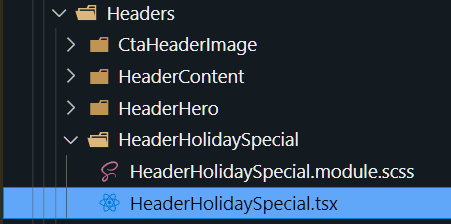
The barebones new
HeaderHolidaySpecial component looks like any other React component. The value of the “content” prop is what Canvas SDK will propagate when the “/cheers” page is rendering:1const HeaderHolidaySpecial: React.FC<CallToActionProps> = ({ content }) => {
2 // content
3 const { title, subtitle, description, ctaLink, ctaTitle } = content;
4
5 // render the component the way you want to here
6 return <div>{"go nuts"}</div>;
7}To spice up the experience, we used
react-confetti and typed.js for the typewriter effect.The process of registration of the new variant is specific to your solution, but the essential version would look like this, where the “resolveRenderer” function returns the instance of the desired React component based on the component type and display variant:
1import HeaderHolidaySpecial from "@components/HeaderHolidaySpecial"
2
3const resolveRenderer = (component) => {
4  ...
5  if (component.type === 'header' && component.variant === "holidayspecial") {
6    return HeaderHolidaySpecial;
7  }
8  return null;
9};
10
11//...
12<Composition data={composition} resolveRenderer={resolveRenderer}>
13  ...
14</Composition>
You can learn more about this technique here.
As a result, we have the /cheers page rendering the new display variant of our Header component along with the content from Contentful and we are ready for the next steps, which can be done without any further development effort.
Part 3: Personalization
Remember we had four audiences to cater to? In order to start personalizing, we will need to configure four different intents in our Personalization section.
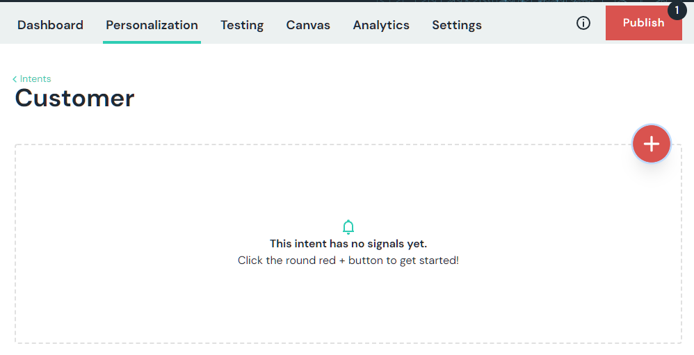
Let’s smash that plus button to create a new intent:

Let’s start with the customer:
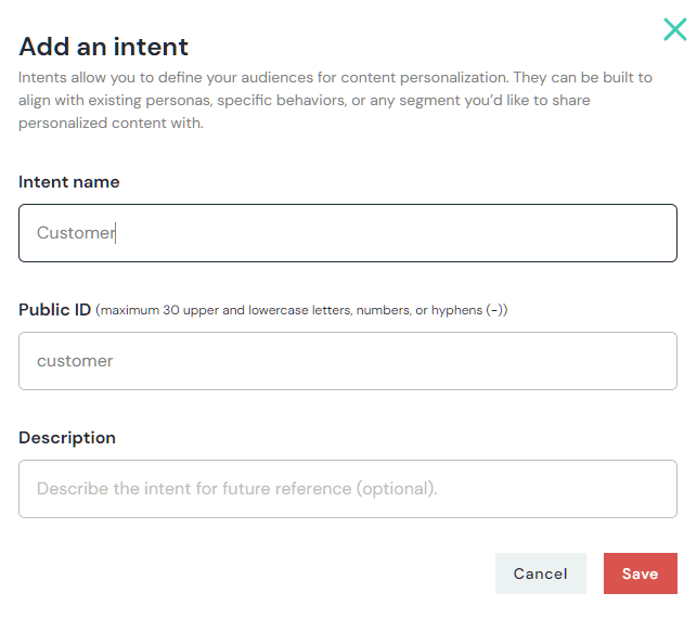
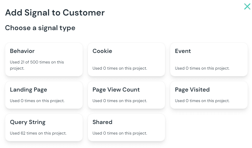
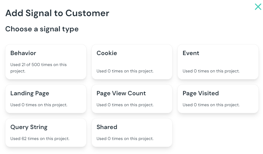
Signals allow the Uniform tracker to understand how to score visitor behavior towards a given intent. You need to add at least one signal:

There are many different signal types. Since we will be baking the query string into the links and QR code on the physical holiday card, the Query String signal is perfect for this use case:
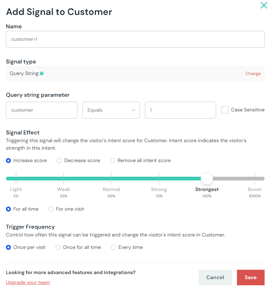
Now we need to configure this signal. This screen shows that adding “customer=1” adds score of 100 towards the Customer intent. That will work!

We then need to repeat these steps for the remaining three audiences (intents):
1. Partner (?partner=1 query string)
2. Investor (?investor=1 query string)
3. Unifolk (?unifolk=1 query string)
After the intents are configured, we can put them to work. While we are at it, we need to publish them as well, so they are available for our intent API.

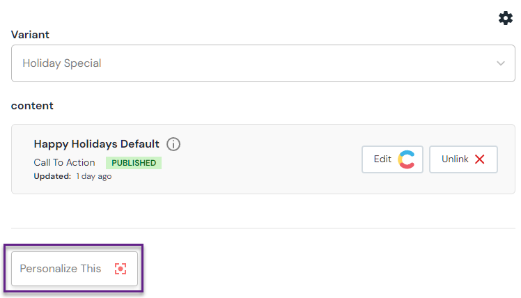
Next step is to assign these intents to our Holiday Special Header component. This is where the “Personalize This” button comes in handy:

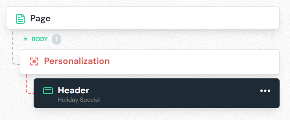
Smashing this button wraps the current component into a special Personalization container, which allows adding any number of other components into it:
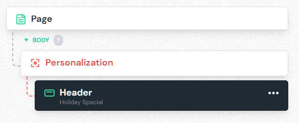
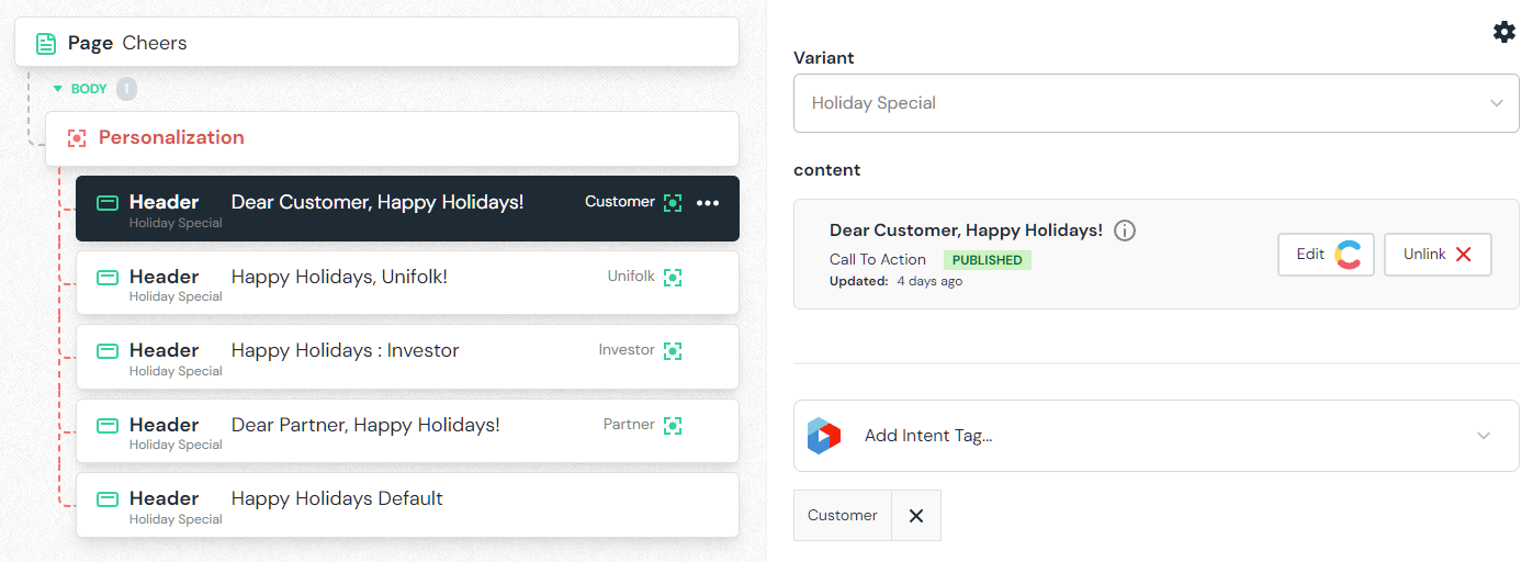
Each sibling component within the Personalization container will be associated with a different Contentful entry and tagged with a different intent. For example, here is what the personalization variant for Customers will look like:

In most cases, you want to have one default variant that is not associated with any intent, so it shows up when none of the intents are resolved. In our case, it will show if no query string added to the “/cheers” page.
That’s all we need to activate personalization. Since the Uniform Canvas SDK is already baked into our Next.js app, no code changes are needed in order to launch the personalization.
Part 4: A/B testing
Now what if want to A/B test different happy holiday messaging, and see which message leads to more engagement or conversion (demo signups). This sounds silly in context of a digital holiday card, but we’re already in deep - let’s do it anyways.
A/B testing can be added using a very similar approach as personalization, just hit the “A/B Test This” button:
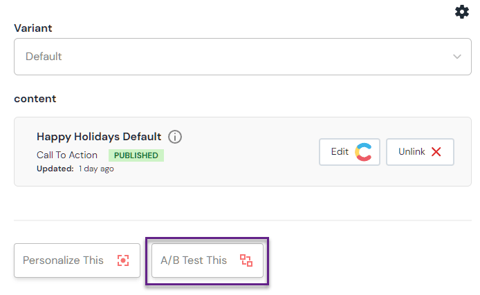
This adds a special “A/B Test” container for our Header component, allowing to select either an alternative component, or alternative content for the same component, or both. This is how we can test a “Season’s Greetings” vs “Happy Holidays” message, for example:

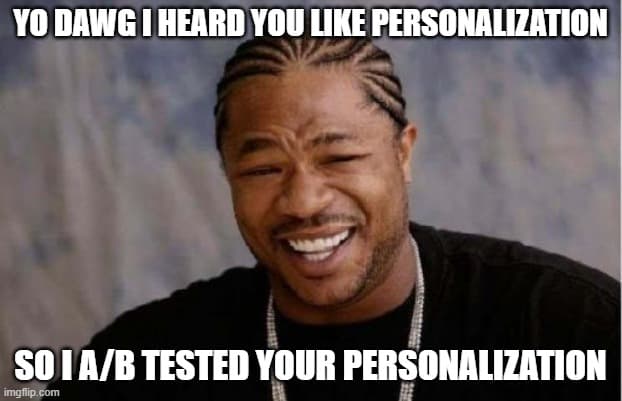
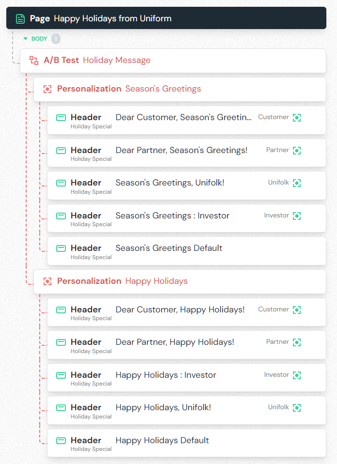
But we already use personalization... No problem! We can A/B test the personalization by nesting the two Personalization containers under the A/B test container:

Part 5: localization
There are two things we want to do with our digital holiday card:
- translate its content
- show a translated version based on visitor context (their browser language and their GEO location).
While the topic of localization goes way beyond these two objectives, we won’t go there for this project.
That being said, if your scenario is more complex and you actually want to serve different experience to folks in different regions, this is possible via our Localization functionality, allowing to vary the structure of compositions by locale and show different sets of components:

For our use case, since the experiences will be structurally identical, we will set up content translation:
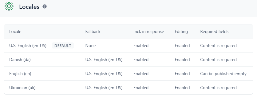
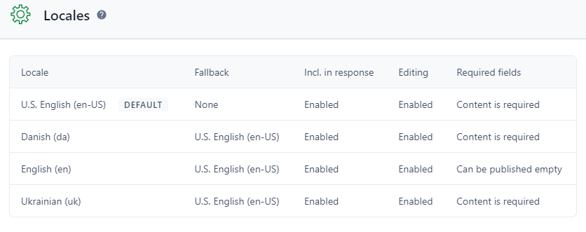
1. Register the locales in your headless CMS. Since we use Contentful for our blog, and Uniform Content Management, it is managed there:
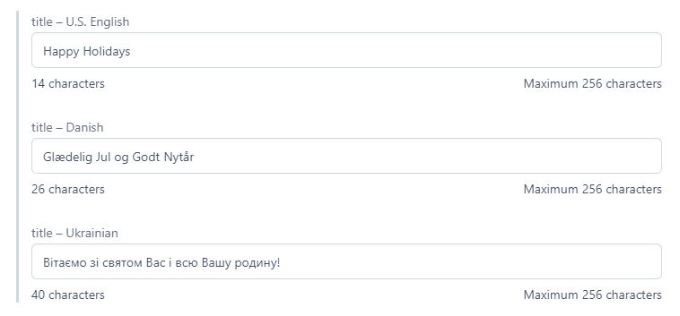
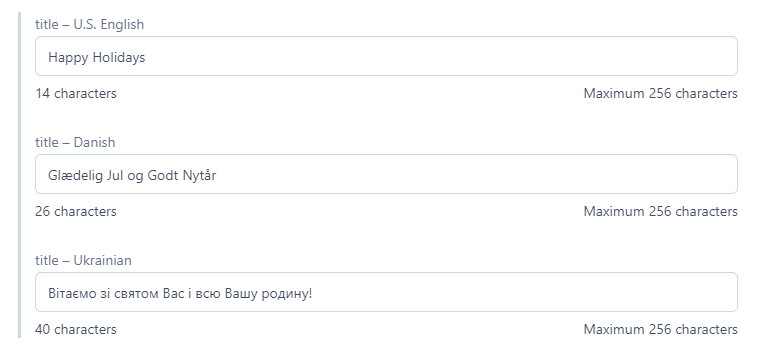
2. Add content in different locales in your CMS:
3. Add localization into your app.
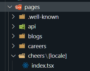
We use Next.js, so we will add the “locale” parameter for our /cheers route in Next.js:
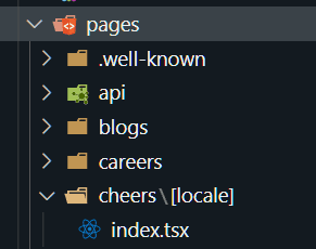
Since we are using the SSG mode of Next.js, for each locale that we want to register, this will create the following pages on the file system:
1/cheers/dk/index.html
2/cheers/ua/index.html
3/cheers/en/index.html
For each page rendered with the locale, the “locale” parameter value will be available within the Next.js context during the
getStaticProps call, which will pass downstream to Uniform’s get composition call:1export async function getStaticProps(context) {
2 await getComposition('/cheers', { locale: context.locale })This makes it possible to access the context locale from the Contentful enhancer (read more about Enhancers here), which is handling the content fetch using standard Contentful client. Notice we pass the locale as return value of the
createQuery function. This is how Contentful client knows which locale to use for which page context:1return createContentfulEnhancer({
2 client,
3 ...
4 createQuery: ({ context, defaultQuery }) => {
5 return {
6 ...defaultQuery,
7 locale: context.locale,
8 };
9 },
10 });You can learn more about this technique in our docs here.
4. The final step is to handle GEO and browser language controlled URL rewrites, so folks visiting from Denmark or browsers with the Danish language configured will be routed to
/cheers/dk if accessing /cheers page. Same for the visitors from Ukraine.We use Netlify as our Jamstack delivery platform for our site, and Netlify has this handy feature allowing us to use GeoIP data and browser language configuration for edge redirects - it is really cool. In combination with shadowing we can simply add the following entries into our _redirects file, re-deploy and have
/cheers page rewrite under the hood to language specific /cheers/ua or /cheers/da versions based on either GeoIP or browser settings:1/cheers/* /cheers/ua/:splat 200! Language=uk
2/cheers/* /cheers/ua/:splat 200! Country=ua
3/cheers/* /cheers/dk/:splat 200! Language=da
4/cheers/* /cheers/dk/:splat 200! Country=dkThat’s all folks!
Check out some of these links and to see the content personalize:
- https://uniform.dev/cheers
- https://uniform.dev/cheers?utm_campaign=customer
- https://uniform.dev/cheers?utm_campaign=partner
All variants will use A/B tested “Happy Holidays vs. Season’s Greetings” message.
If you happen to visit from either Denmark or Ukraine, adding the language code prefix into the URL is completely optional since this page will localize at the edge:
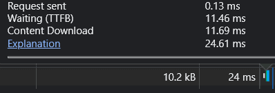
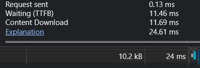
How about performance and scale? Since the page is completely pre-rendered (along with the personalizations and A/B tests), the Time to First Byte (TTFB) is blazing fast since there are no servers to bake this page. I am getting less than 12ms TTFB from SFO with ~25ms document download, but your mileage may vary:
Everything that was shown in this post can be repeated on a free account, so if you haven’t signed up yet, sign up for a Uniform Visual Workspace trial, and create your first project!
Happy Holidays, folks, thanks for making it to the end of the post, and remember, do not pronounce 2022 as “2020, too” 😊












.png&w=1080&q=90)
.png&w=1080&q=90)
.png&w=1080&q=90)