Uniform blog/Information architecture: organizing and structuring web content
Information architecture: organizing and structuring web content
Information architecture: organizing and structuring web content
What is information architecture?
Information architecture (IA), which plays a critical role in user experience (UX), is the process of organizing, structuring, and labeling content or navigation to make it understandable, searchable, and deliverable. Specifically, you define content models and relationships, navigation systems or other hierarchies, and metadata, thus helping the audience find what they're after on websites, applications, or other digital products.
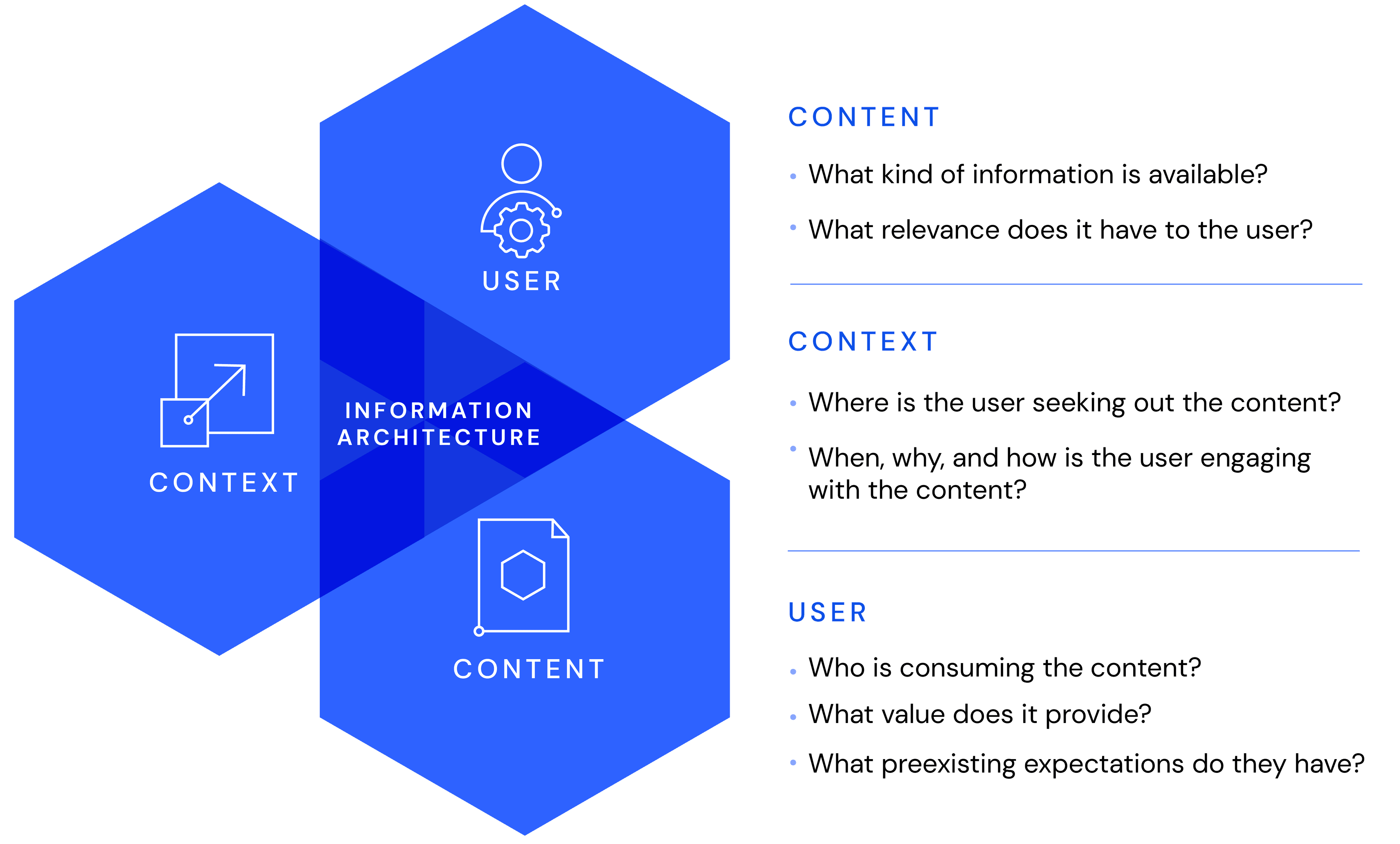
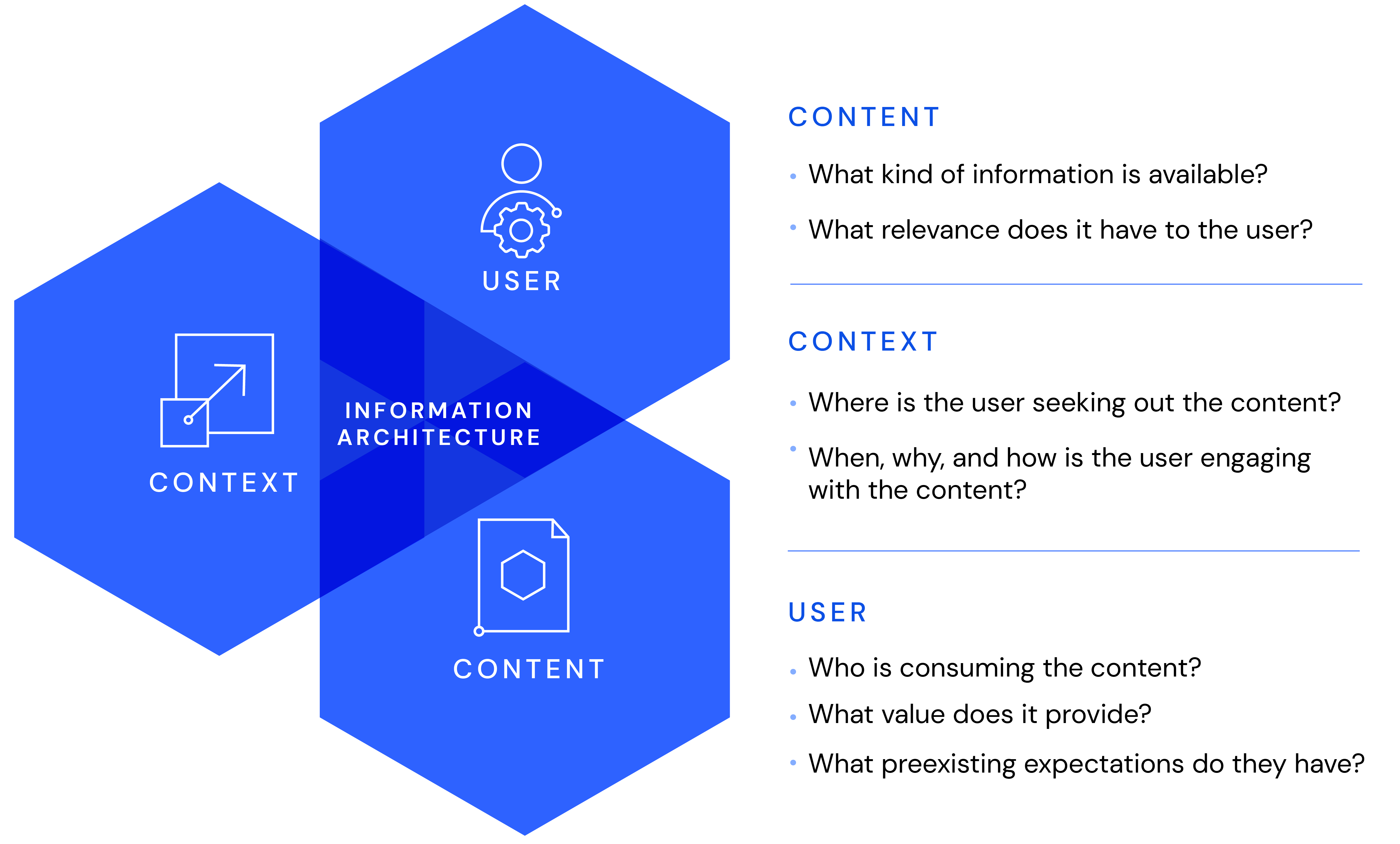
IA versus UX versus UI
Effective IA starts with arranging content in a channel-agnostic way for reuse in applications (websites, mobile apps, email, etc.), relating closely to UX in content presentation, navigation, and findability.
User interface (UI) is a separate process. To function well, designers must have access to the IA, but not the other way round (see the section on wireframing below).
All told, UX results from IA and UX working seamlessly together.
Principles of IA
Written by Dan Brown, this detailed set of IA principles is an excellent resource for ensuring that your IA is scalable and reusable. If you find them too academic and complicated, simply think of IA as “the right content to the right audience at the right time” and proceed from there.
In other words, start with a clear understanding of your audiences and their needs, which will help you identify the content your stakeholders are seeking. Once that foundation is in place, you’ll find Dan Brown’s principles intuitive and valuable.
Those principles are—
- Objects
- Choices.
- Disclosure.
- Exemplars.
- Front doors.
- Multiple classification.
- Focused navigation.
- Growth.
Design process of IA
1. Stakeholder research and analysis
Also called domain modeling, this step relates to the core functions or domain expertise of a business. For a manufacturer, research and analysis of domain modeling involve looking into products, parts, and their relationships to other products.
Stakeholder research consists of two phases: identification of the domain model, the data sources, and the creative teams; and determination of how the audience interacts with that information. For the manufacturer example, customers might have multiple avenues in which to locate product information. Visitors who are not customers might browse categories through hierarchical navigation and then filter through and compare options with taxonomies and tags. Similarly, for support information, the audience might enter a serial code, look up the related product, and display the relevant assets, such as manuals.
2. Content inventory and audit
In the past, even though most organizations already had content in one form or another, they ignored it in favor of doing “the new thing.” Such a practice made sense in light of the barriers against easily integrating the existing sources. Consequently, resource-constrained organizations simply discarded a lot of valuable content and SEO.
Now that composable architectures are more common, you can easily incorporate content and navigation into a larger plan. Be sure to, however, audit the data to determine if it’s up to date and accurate and whether it’s effective in enabling you to achieve your goals.
3. Content modeling
Content modeling is the first step in putting domain knowledge and content strategy into practice through the creation of content types, field definitions, and references among those types.
For details on content modeling and content strategy, see these resources:
- What is content modeling?
- The importance of a single source of truth
- Five tips for ensuring scalable content
- How to build a content model with examples
- Creating an effective content strategy
- A complete guide to content pillars
- Nine best practices for content modeling
4. Taxonomies, hierarchies, and navigation
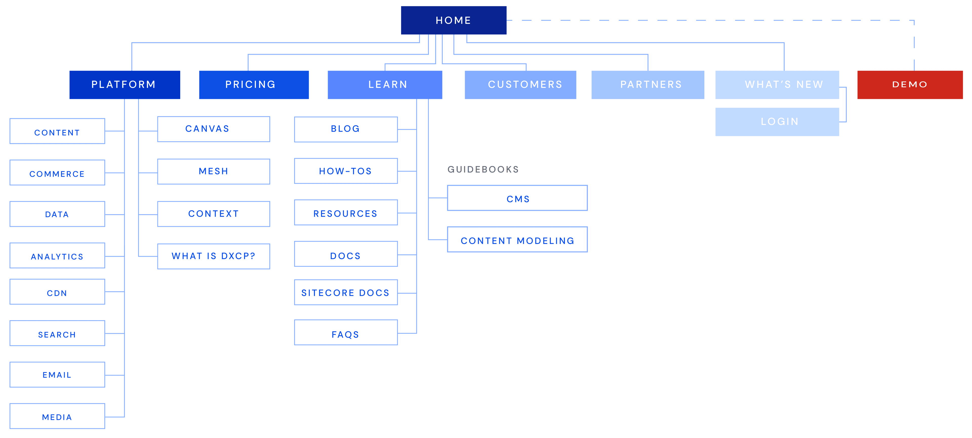
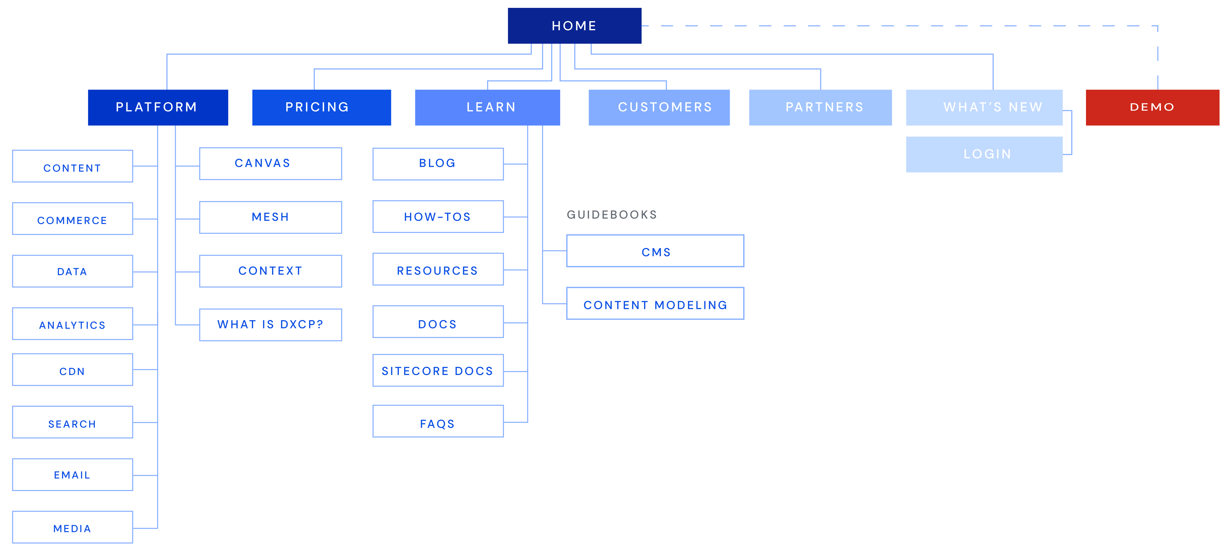
Depending on the complexity of your content, it might be beneficial to apply to it additional levels of categorization and organization, e.g., taxonomies and hierarchies. Those ways of categorizing content fosters findability—not just for your audience, but also for content creators. Navigation through UI elements like menus, toolbars, and breadcrumbs, is handy, especially for end-users.
In simpler CMS implementations, you might need to define the content model and content only, handling things like navigation and routing with organizational tools outside the CMS. However, as applications complexify, those tools become more and more important for usability and findability.
5. Wireframing
Wireframing is extremely controversial in IA. As Carrie Hane correctly stated, “The design of a website should be informed by the content, not the other way around; it should start with what needs to be said rather than how it should be displayed.”
Nonetheless, wireframing, often required for stakeholder buy-in, continues to be part of the design process. Content models and navigation are no-brainers for content strategists, who can easily visualize the end result, but less so to novice stakeholders.
Carrie also observed, “You need to change the mindset of not just the team but your organization’s decision-makers and your clients.” Oftentimes, that’s the hardest part of the entire endeavor, which is why such old habits as wireframes are occasionally pulled into the process.
6. Usability testing
Usability contains an internal and an external aspect.
Internal usability tests reflect how quickly teams can create and publish content, i.e., are they propelled or hindered by the system? For example, for all that metadata is key for findability, that’s an additional task for creators, who must often meet stringent publishing deadlines. To speed up the process, find out if you can automate that creation task with machine-learning tools. If so, do you trust that output or do you still need a review by subject-matter experts?
External usability testing answers these questions:
- Can your audience easily find content?
- Is your navigation intuitive to them?
- Are they often defaulting to search? If so, do your search and recommendation features work well?
- Does your personalization capability result in fewer clicks and more ideal outcomes?
The IA-related benefits of a digital experience composition platform like Uniform
A key advantage of structured content is that it supports creation and reuse by breaking up content into core components and relationships. Besides, the presentation-agnostic approach means that you can reuse content in multiple channels.
Challenges abound, however, especially when edge cases emerge. The first problem is visual control for content creators. Adding callouts or quotes and defining their relationships to the related content and their display requires implementing in the content model the ability to add those relationships and specifying their formats. However, the content model then becomes polluted with design cues on content display and channel-specific use.
Uniform Canvas, which is part of a digital experience composition platform (DXCP), deftly solves that issue, ensuring that content models are and remain presentation agnostic. As a result, you have absolute freedom in assembling multisource content in various channels on a DXCP like Uniform.
Ultimately, the CMS should be responsible for the core content model and content; and the DXCP, for the representation, navigation, delivery, and personalization of that content.
A website’s navigation structure and the ways in which users interact with a mobile app are typical IA examples.





.png&w=1080&q=90)
.png&w=1080&q=90)
.jpg&w=1080&q=90)